Brand Style Guide
We have created this landing page as a resource for you. You'll find guidance around each of the key elements of the brand: Primary and Secondary Logos, Color Palette, Typography, and examples of existing materials.
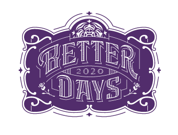
Primary Logos
1. PRIMARY LOGO
This mark should be used wherever possible – as it is the feature brand element. This logo badge has quite a bit of artistic detail, it should never be used smaller than 2 inches wide.
2. PRIMARY TYPE LOGO
This is a very clear and clean variation of the Better Days 2020 brand. This type variation should be used as a complement to the Primary Logo.


Logo Color Use
1. PRIMARY COLOR
Gold is the primary color for the BD2020 Logos. Wherever possible, this is the first color that should be selected.
2. SECONDARY COLOR
In some instances, a color with more contrast is required for one color printed materials. In this case, BD2020 Royal Purple may be used.
Seals & Stamps
These monograms and seals are secondary elements to the Better Days 2020 Brand, are a support element to the Primary Logo and Primary Type Logo.
These seals and stamps can be used in a variety of ways—from promotional materials to merchandise. In any use, size should be considered carefully so artistic details are not lost.
Because these are secondary brand elements, please contact our team to get permission to use them.

LET IT BREATHE

Do not place any content (graphics or text) within the “clear space” of the any of the BD2020 logos.

Logo Do Nots
DO NOT SQUEEZE OR SQUISH
Never alter the logo to “make it fit.”DO NOT ALTER THE COLORS
DO NOT OUTLINE THE LOGO
DO NOT ADD DROP SHADOWS OR OTHER EFFECTS
DO NOT CHANGE TRANSPARENCY
DO NOT TILT
Color Palette
Gold and Royal Purple are the primary colors for the BD2020 Brand. Please use additional colors Dark Gold and Stone Gray for type, so it is as legible as possible. Light Gold is excellent for background floods of color.
